Google Web Stories Platform Development
In 2017/18, Google built an immersive, full-screen mobile format that offered visually-rich storytelling to the open web. In order to develop the new medium, the Google AMP and Development teams partnered with high-impact publishers to create content, test features, and consult on tools and functionality. I participated in the development process as the lead UX and Visual Designer for Meredith’s brands, meeting weekly with Google constituents, testing new code formats with real content, providing active feedback on work-in-progress features, and establishing the mobile visual identity for People and InStyle. After nearly a year of work, the format (known initially as AMP Stories) launched publicly in February 2018. To date, more than 2,000 websites have published Web Stories.
ROLE: UX/UI DESIGN lead consultant
Functionality testing
Feature consulting
WIREFRAMES
VISUAL DESIGN
QA
IN COLLABORATION WITH:
Google, Engineering, Editorial
The Problem
Per the Google Developers Blog, figuring out how to create immersive mobile content that functions well and loads quickly, “often poses prohibitively high startup costs, particularly for small publishers.” To overcome these initial challenges and costs on their behalf, Google partnered with a number of large publishers in order to build and test the framework. The end goals of the project were as follows:
The Stories should offer a more accessible, open-source alternative to Instagram and Snapchat stories.
The Stories should be available to be consumed openly across the web, rather than only through a closed, in-app ecosystem.
The Stories should be available to be consumed on any device, but be optimized for mobile browsers.
The Stories should be free for any website to create.
The Stories should load more quickly and consistently than current high-visual mobile web products.
Process & Partnership
As a publishing partner in the Web Stories development process, I met with Google representatives 1-2 times per week, and worked with an engineering partner to implement new code and test new features. Together, we built beta Stories, tested features across multiple devices and browsers, and provided functionality feedback to the Google team. I also advised Google representatives on the internal challenges of creating content for Stories, in order to inform their public guidelines and best-practices documentation.
The Challenges
The search-driven, open-web format of Stories created challenges that their Instagram and Snapchat counterparts did not face. Namely, closed-door apps are able to store data on devices in a way that the open web cannot, allowing these apps to load larger and more complex graphic files. The apps can also force a more consistent experience ratio, overcoming the varying screen sizes and resolutions of different mobile devices. We discovered the following issues as the main hurdles in creating a Web Stories:
The Solution:
Instead of uploading large, fixed-dimension video and images, we split each page into a series of smaller elements. Those element were then “stacked” on top of each other, creating the illusion of one complex file. Splitting the assets like this allowed for a few things:
The elements loaded much more quickly, as each layer was a significantly smaller file size.
The elements could be individually placed relative to each other, in order to expand and contract with changing screen sizes, rather than simply crop.
Using delayed CSS, each image layer could be animated separately and sequentially, creating smooth motion without the heavy lift of a single video file.
Video layers were restricted to smaller, simple files like backgrounds, and contained nothing that could be lost on a crop.
The outcome was the appearance of a single cohesive visual, but with the quick load time of smaller pieces.
Additionally, we created a specific “zone” at the bottom of each screen where tap navigation is disabled when hyperlinks are present, allowing for text and outlinks.
Our Recommendations:
Once we had a solution for the main content functionality, myself and my content collaborators recommended a number of future developments that we saw as integral for realistic wide adoption of Web Stories. We recommended Google look into:
Ad integration, specifically the ability to incorporate programmatic ads.
A CMS or similar tool for easy creation of Web Stories, allowing for people to easily create them without requiring hard-coding by a developer.
The ability to embed Web Stories within existing content pages, allowing for them to be deliberately surfaced on publisher websites in addition to discoverable via search results.
Elevated presence in search results, and more transparency about how to get your story to show prominently.
Recirculation within Web Stories to drive users into more Stories, or back to the publisher’s traditional content.
The Outcome
Web Stories were released in February 2018, using the layered stacking method for elements, and coded zones for tapping interaction. The platform has grown significantly since then, with Stories built by over 2,000 different websites to date.
Many of the content recommendations we made during development are documented as best practices, with my team’s discovery of animating objects individually called out specifically. The platform also now offers some of the future features we had recommended as well, like CMS/construction tools, embed integrations, programmatic ad capabilities, and prominence in Google Discover.
Web Stories Brand Design
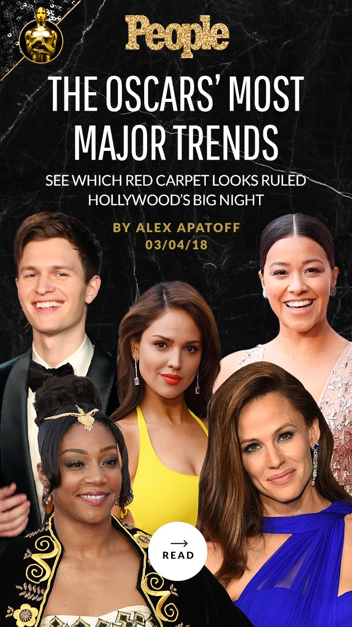
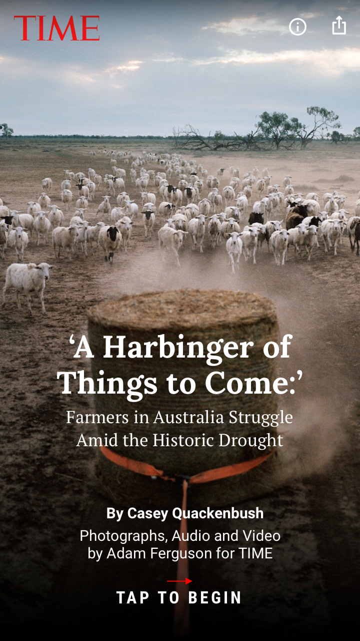
In addition to consulting throughout the development process, I established the visual identity and Web Stories style guides for two of Meredith’s most prominent brands, People and Instyle. I also created individual stories for Entertainment Weekly, Sports Illustrated, Travel + Leisure, and TIME. Check out some of these Stories below, and view an index of People’s Stories here.
